Farm fresh produce order and delivery app
Sea Breeze Organics is an app we created for a family-owned farm that would like to make its produce more accessible to residents. My roles in this design sprint consisted of user research, usability testing, and prototype creation.
What if families of Bamboo County never had to go without fresh produce?
My reflections will go here.
Due to the lack of reliable affordable quality produce in Bamboo County, residents must travel over 100 miles to obtain produce for their families.
The problem
This was a finding from early user interviews.
Sea Breeze Organics app ensures users can pre-order affordable quality produce and arrange delivery within Bamboo County.
The solution
The app has been so successful that the farm has been able to expand!
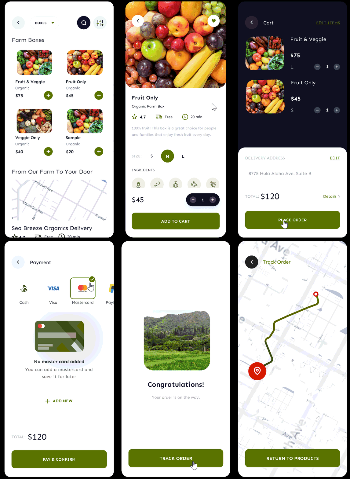
This GIF represents a user flow for purchasing a product.
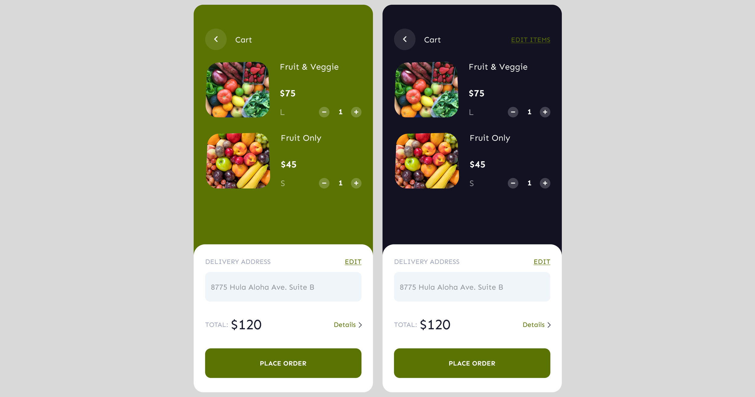
The cart screen was the most challenging to design.
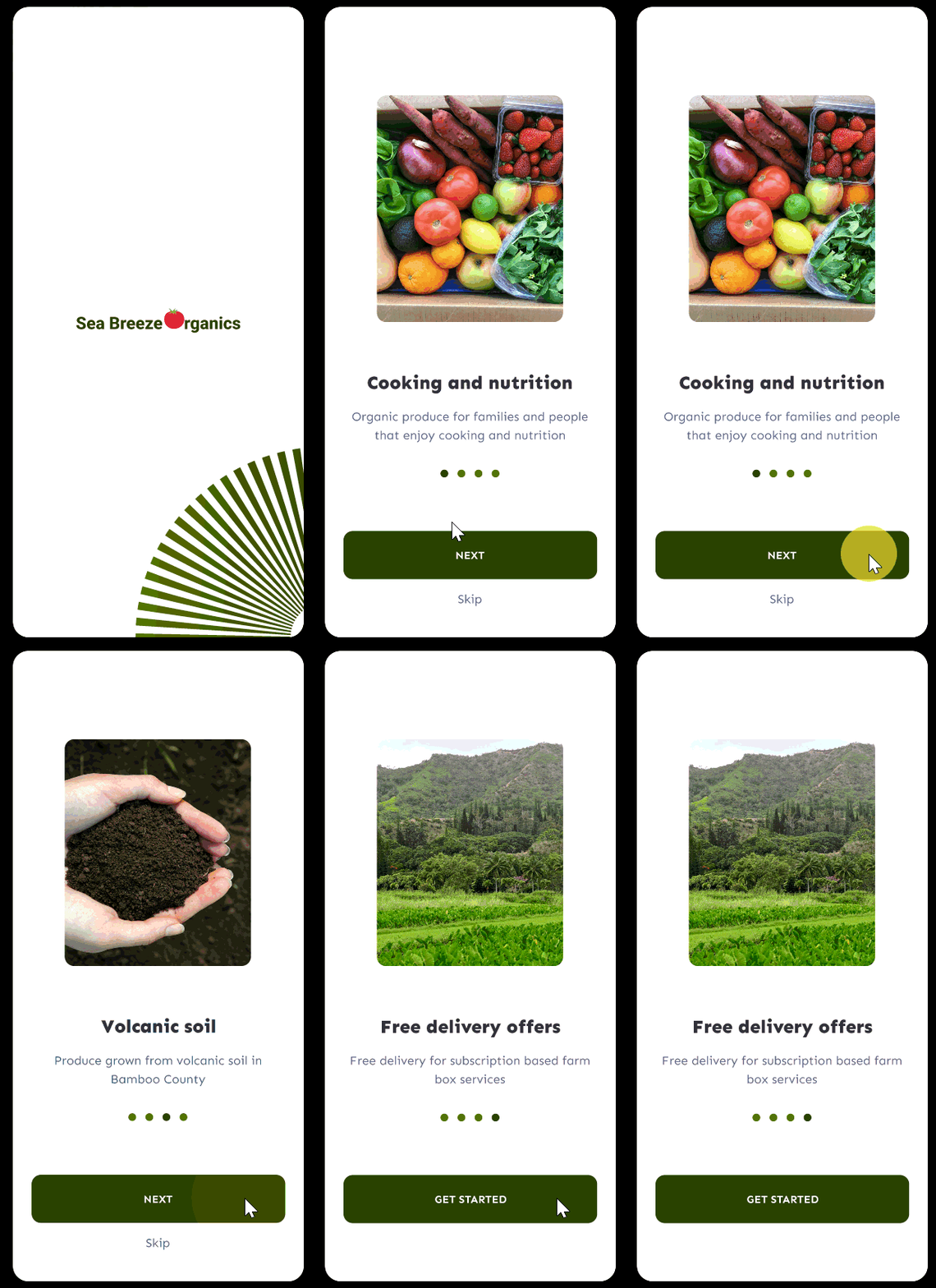
This GIF represents the onboarding flow for first-time users.
We want to make sure users know what the farm and app are all about.
My UX process
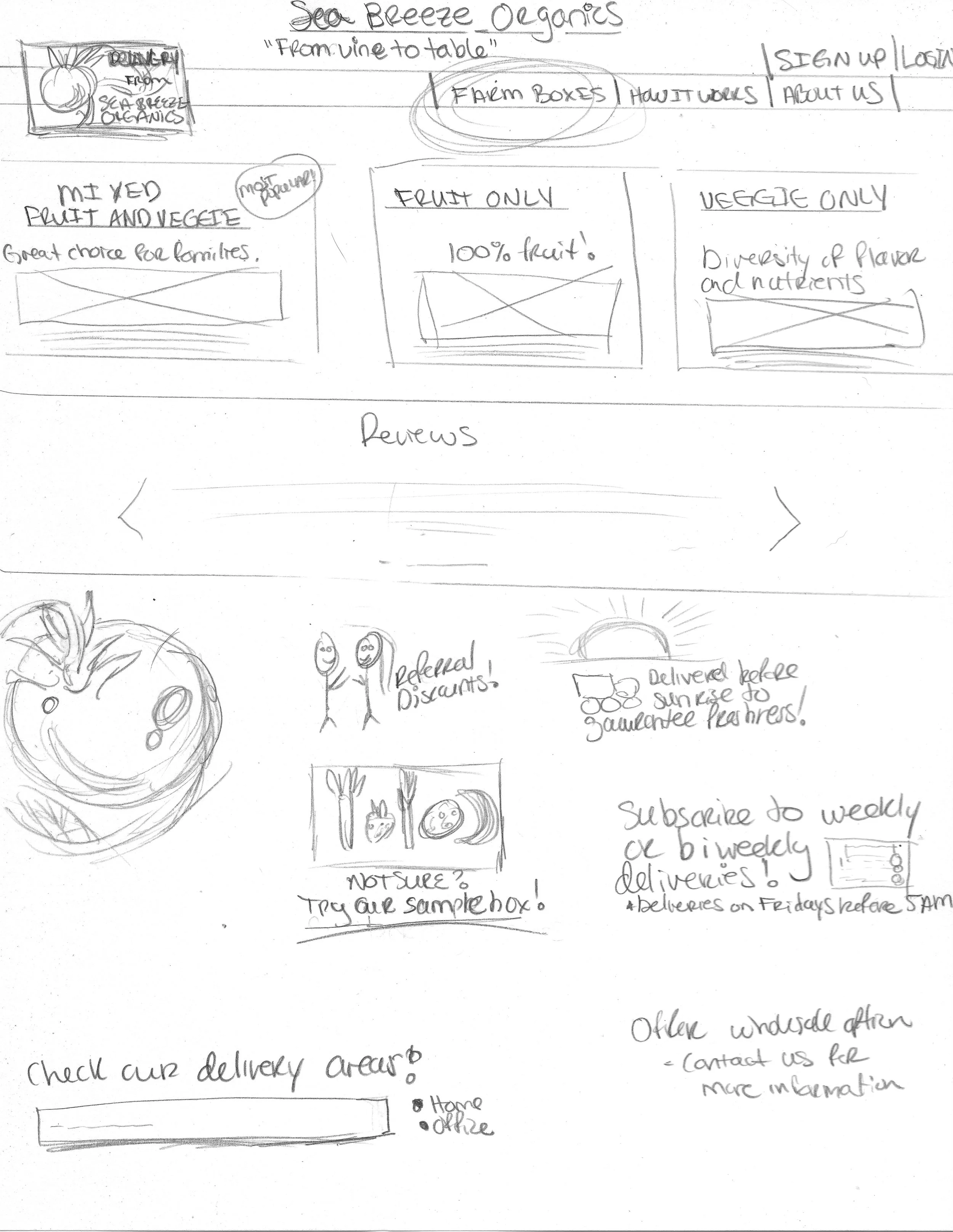
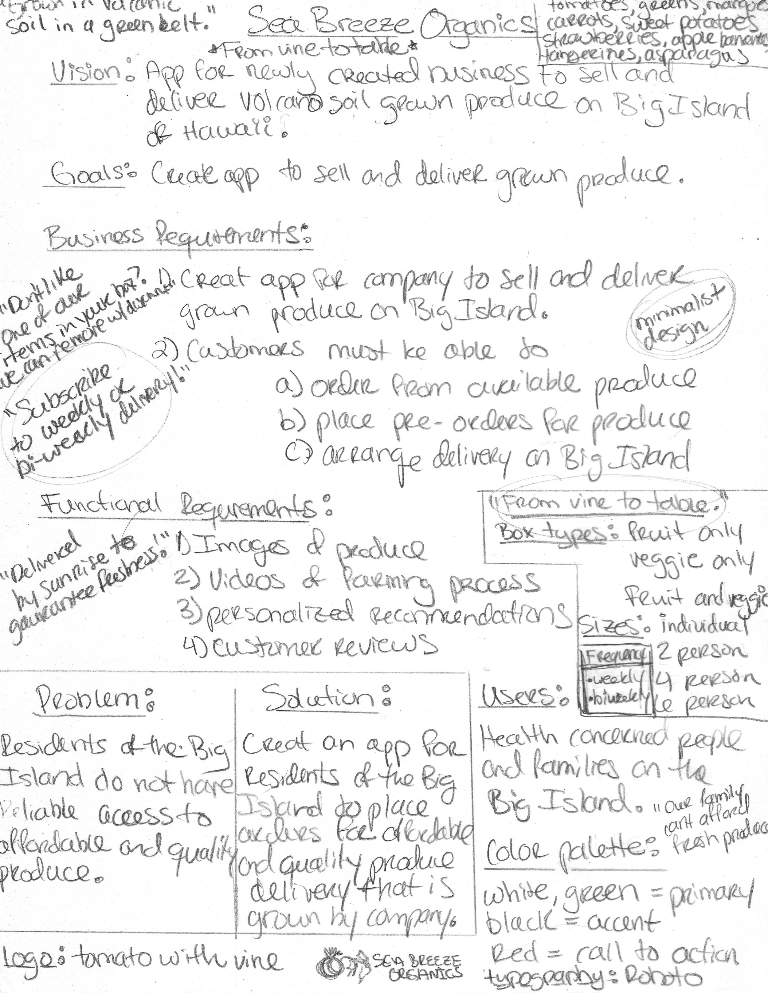
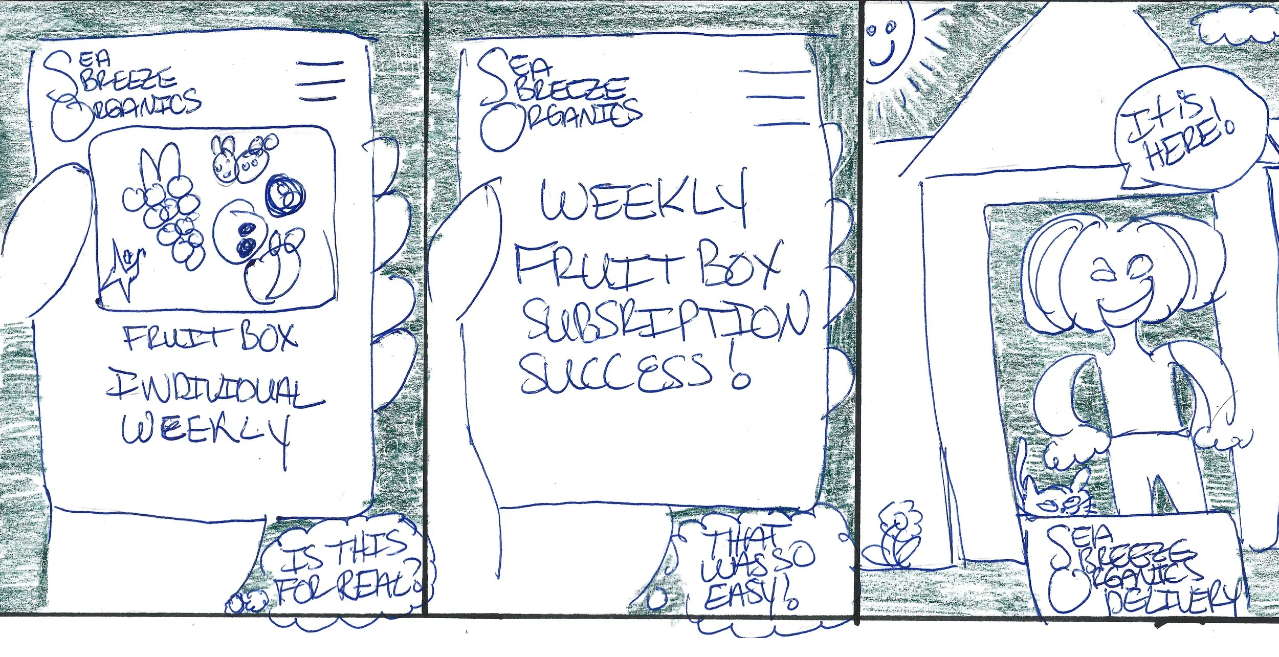
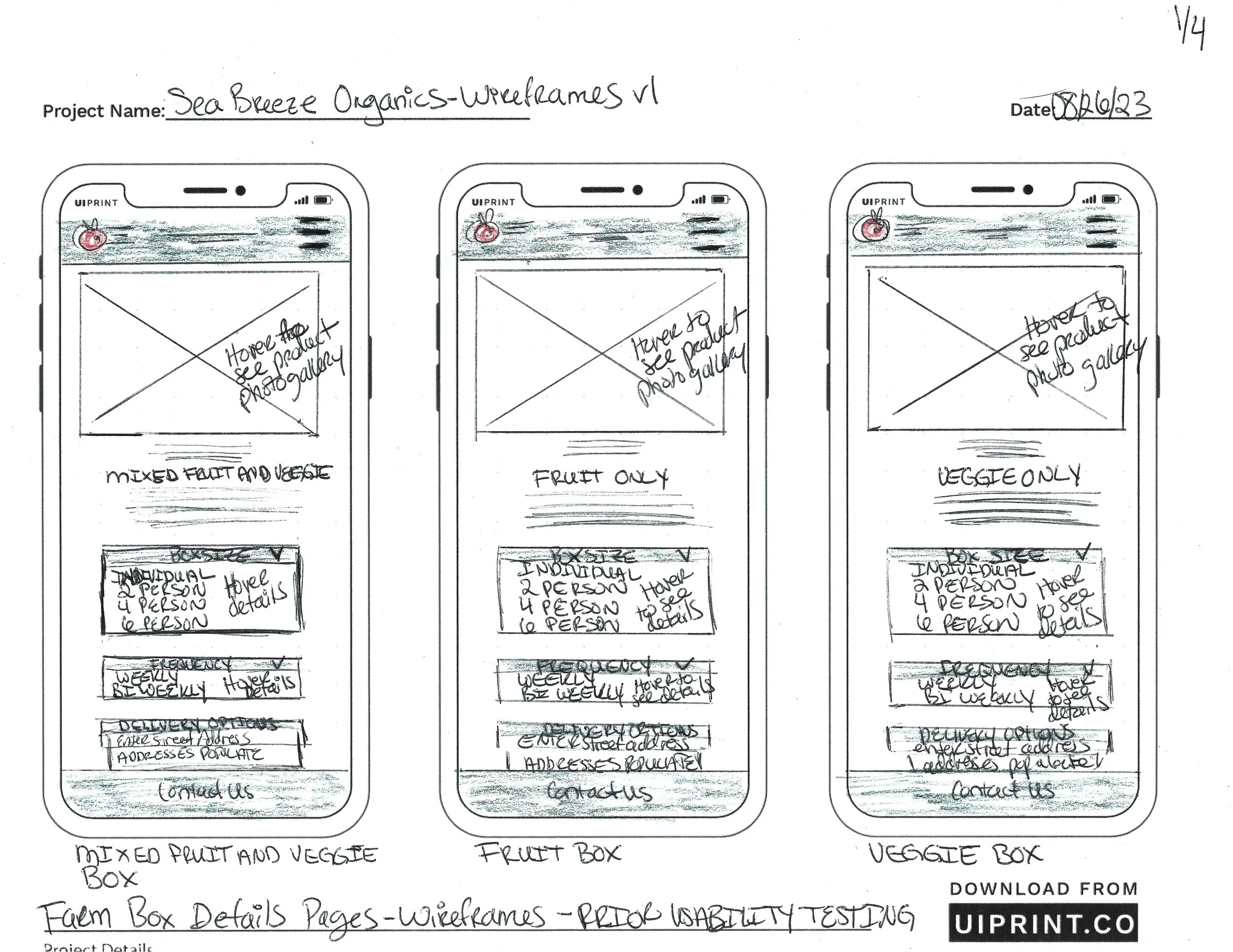
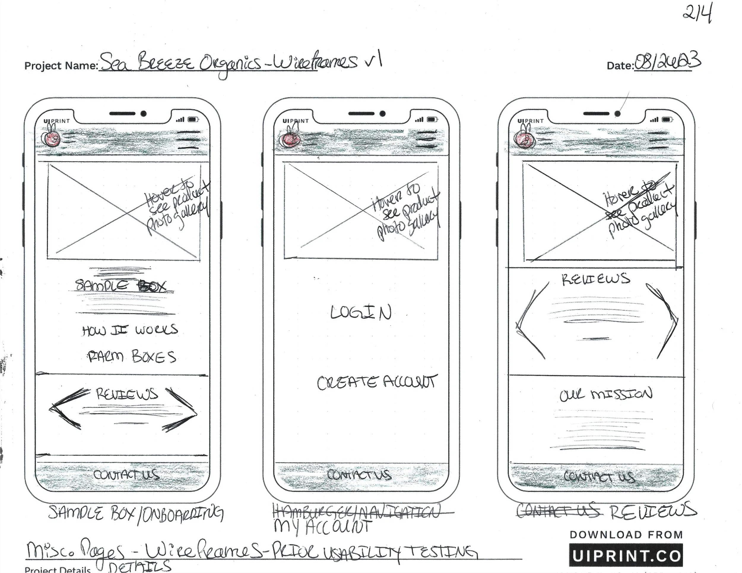
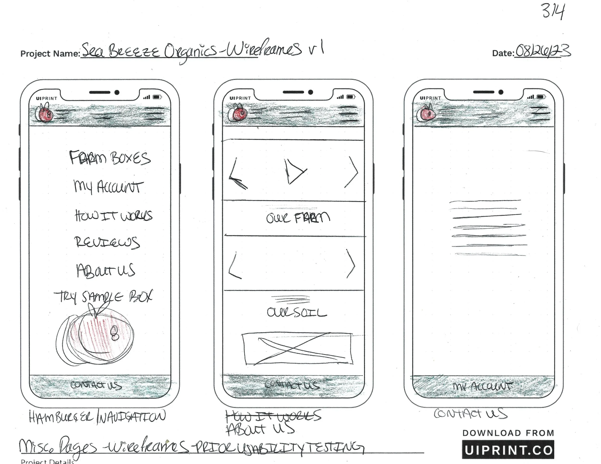
First, we brainstormed and sketched our early ideas.
Research
The artist in me loves this part of the process!
Next, we spent two weeks interviewing potential users at local farmers’ markets and using online surveys. The qualitative data and findings gained from the interactions drove our design process.
“I have to drive over four hours to get affordable produce for my kids.”
Local Resident
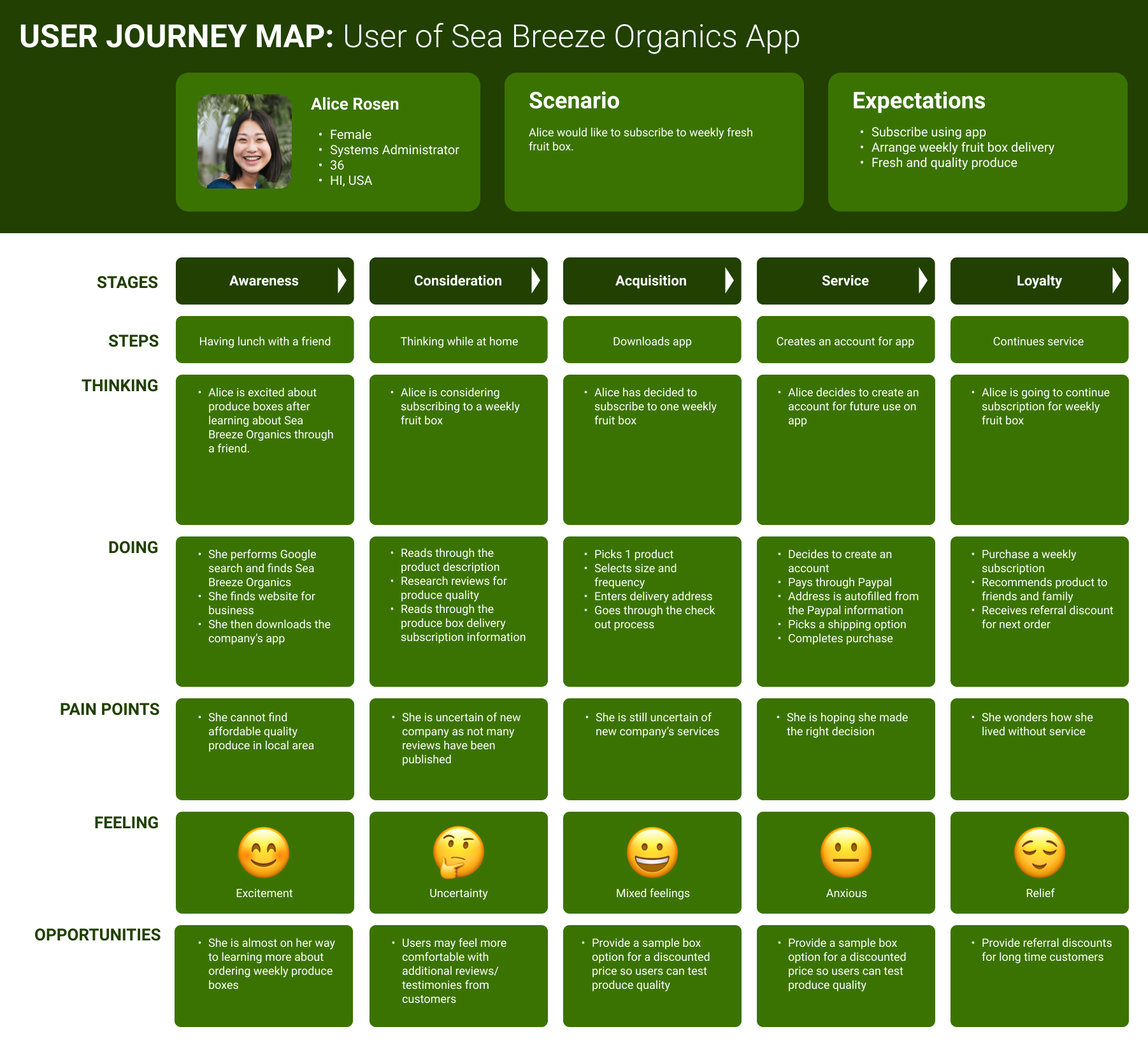
The below user journey map was created with the findings to capture the user’s experience.
Developing user empathy and journey maps helped us think like a potential user.
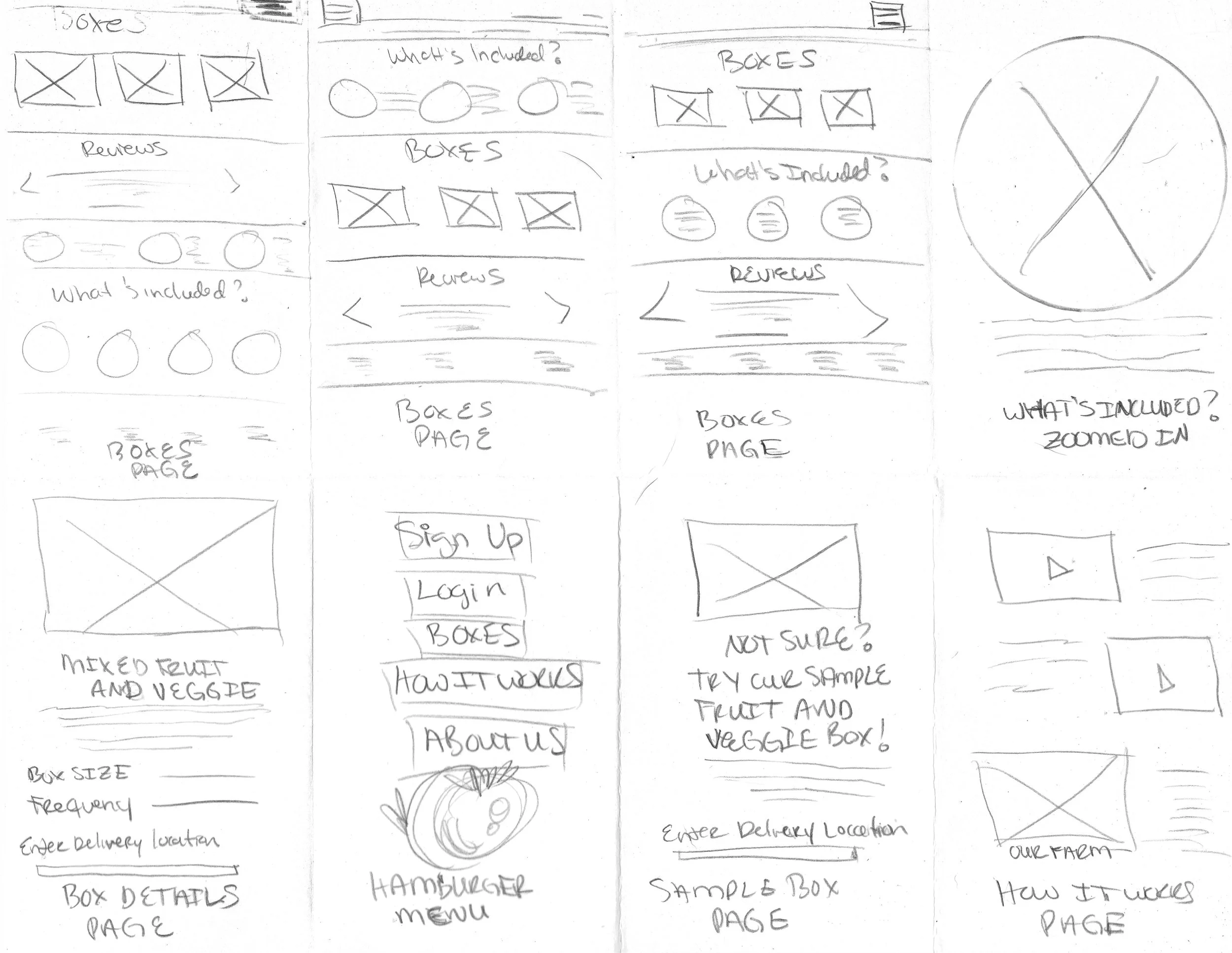
Then we created paper prototypes, did Crazy 8’s design sprints, and sketched wireframes to determine visual design characteristics for the app including branding and logo creation.
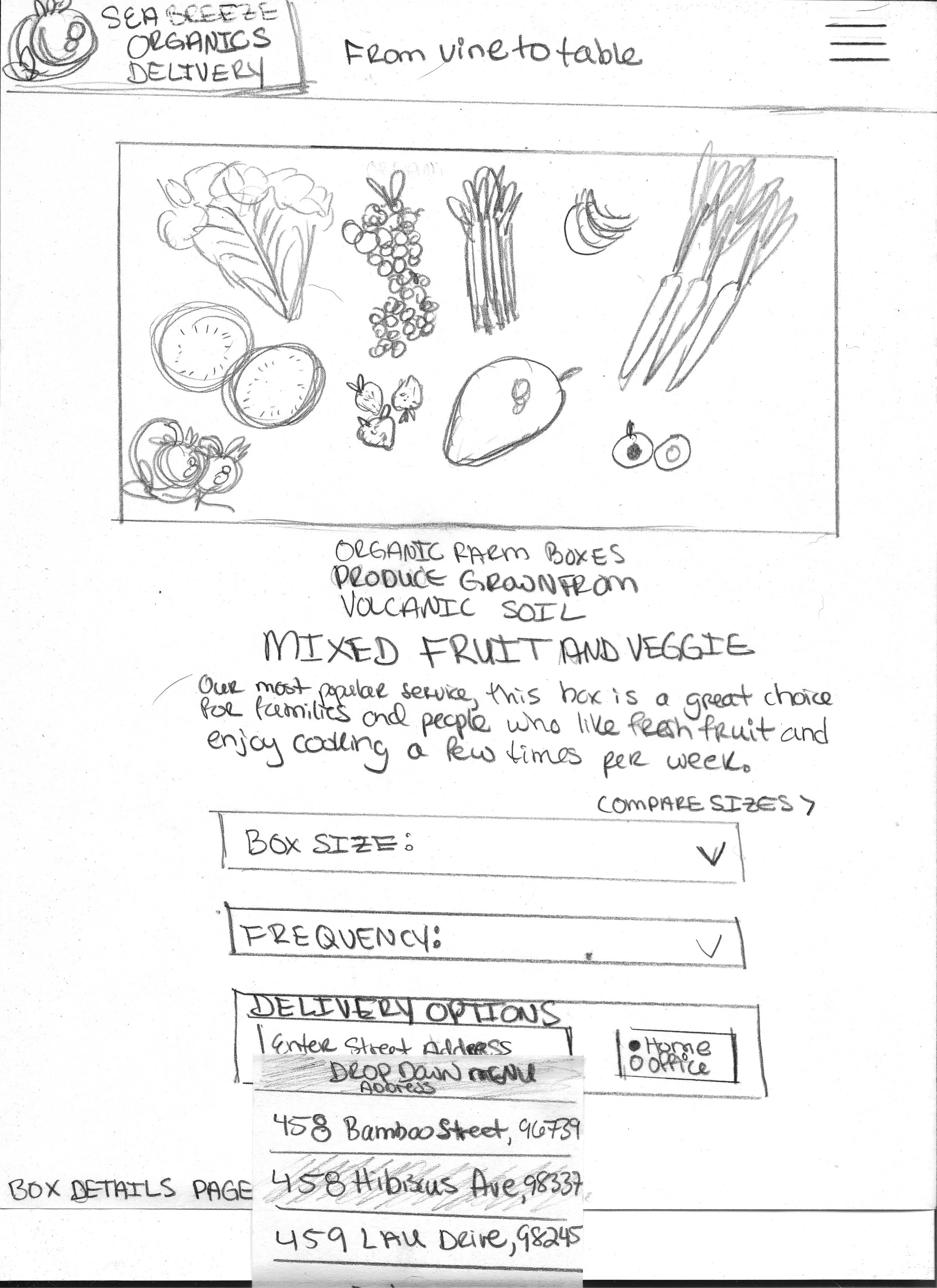
Paper prototyping
Sketching this paper prototype was my favorite.
After in-person usability testing with three volunteers scouted from user interviews, key findings resulted in the following prototype iterations.
Prototype Iterations
I promise this is not a planted quote from testing:
”This app is going to change my family’s lives!”
Usability tester
Call to action area for the “place order” button indistinguishable due to the color palette matching the background.
Usability testing finding 1 of 2
Iteration
Background color was revised per comparisons below from before usability testing on left and after iteration on right.
The cart screen proved to be just as challenging for users as the designers!
Usability testing finding 2 of 2
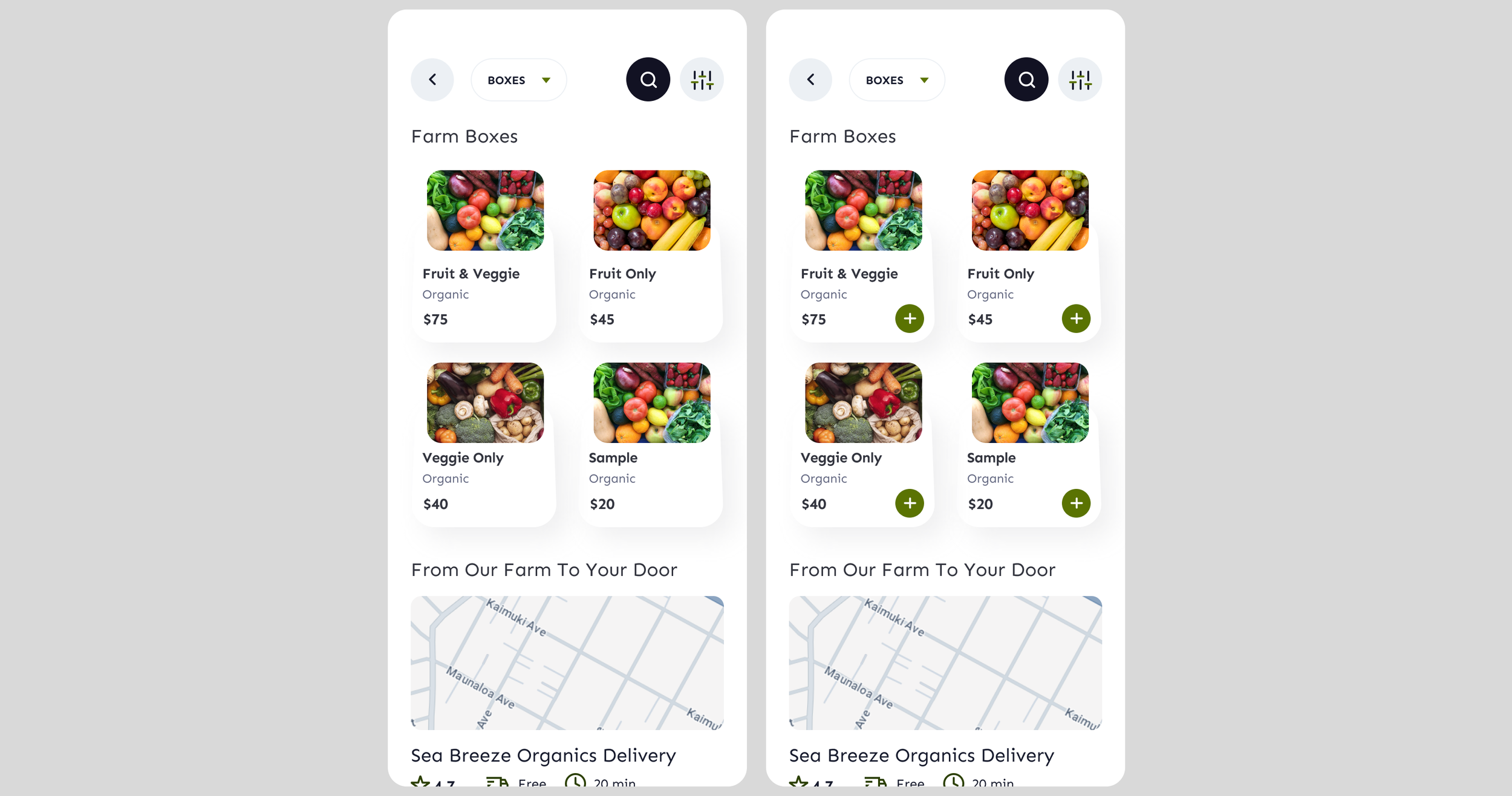
User flow repetitive for adding multiple products to cart.
Green quick-action add-to-cart button added to streamline user flow per comparisons below from before usability testing on left and after iteration on right..
Iteration
Usability testers appeared bored when repeating the same user flow while adding multiple products to their carts.
Eliminating the requirement of the product details screen was accomplished by saving previous product choices such as delivery address and box size.

